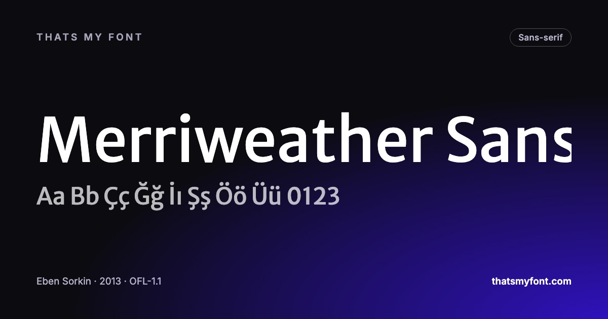
Choosing Fonts for Slides That Read From the Back of the Room
Projectors wash out thin type and meeting rooms are deeper than they look. Font choices that survive a projector, and how to stop PowerPoint swapping your font.
Questions that come up around downloading and using free fonts, answered with the files on this site rather than in general terms.
Projectors wash out thin type and meeting rooms are deeper than they look. Font choices that survive a projector, and how to stop PowerPoint swapping your font.
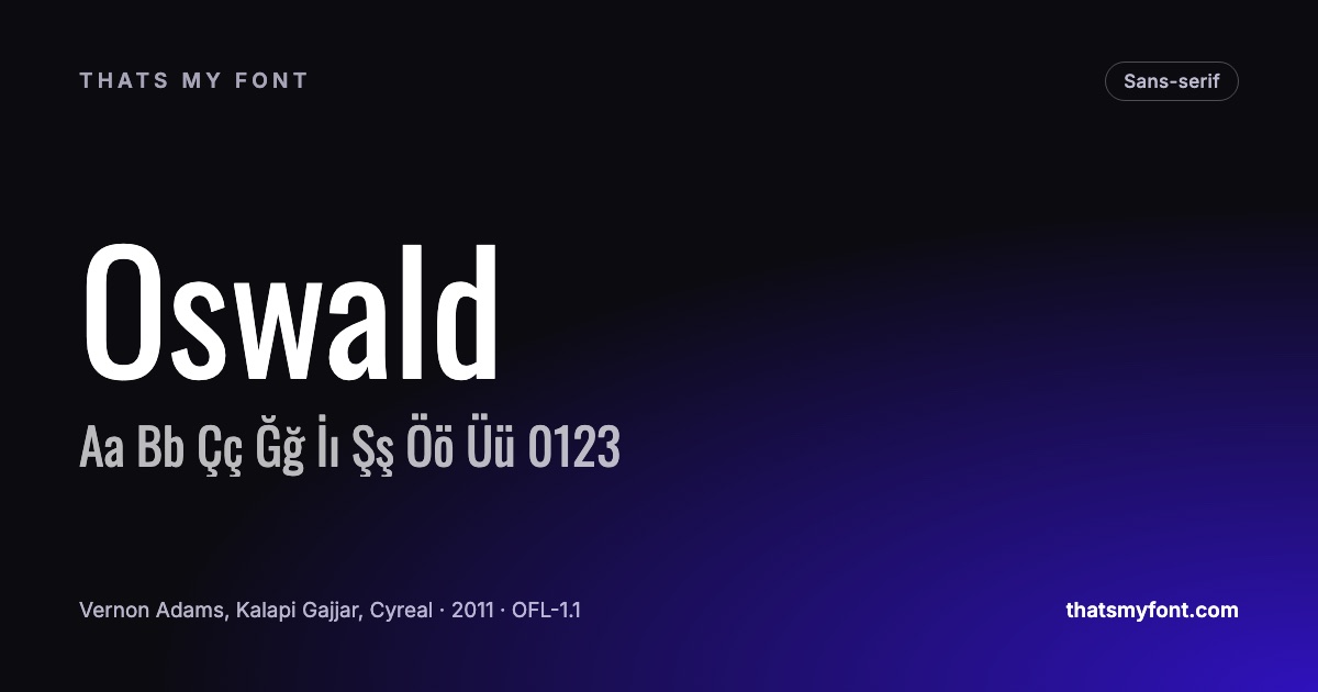
Narrow type fits long headlines, busy tables and tall signs. The free condensed families worth knowing, and why they rarely belong in a paragraph.
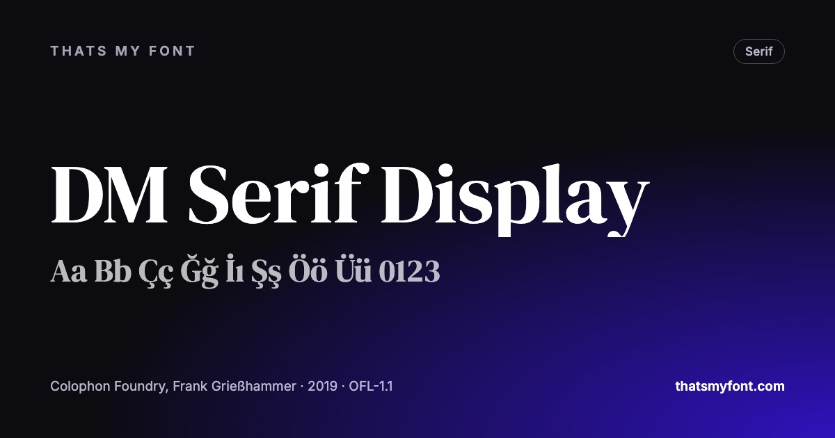
DM Serif Display and DM Serif Text are the same design drawn for different sizes. What optical sizes are, why they matter, and what happens if you use the wrong one.
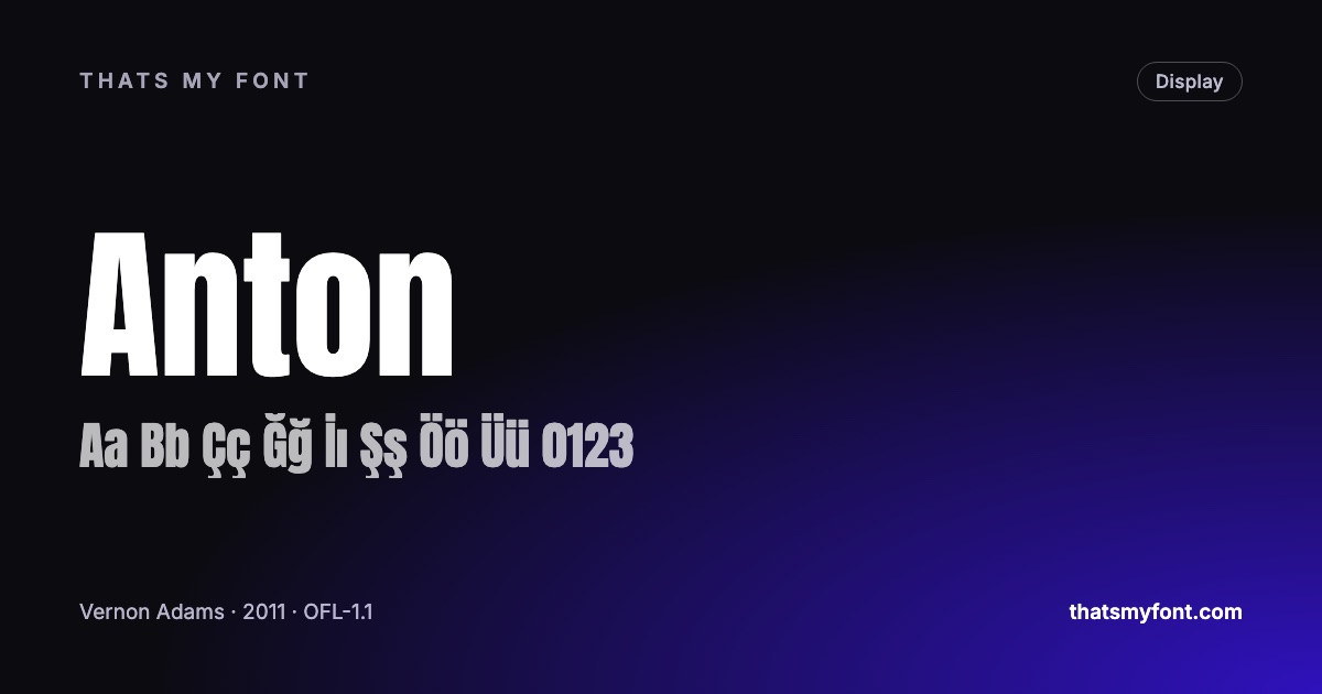
A thumbnail is judged at the size of a postage stamp. The fonts that survive that, how many words fit, and the outline and contrast tricks that keep text legible.
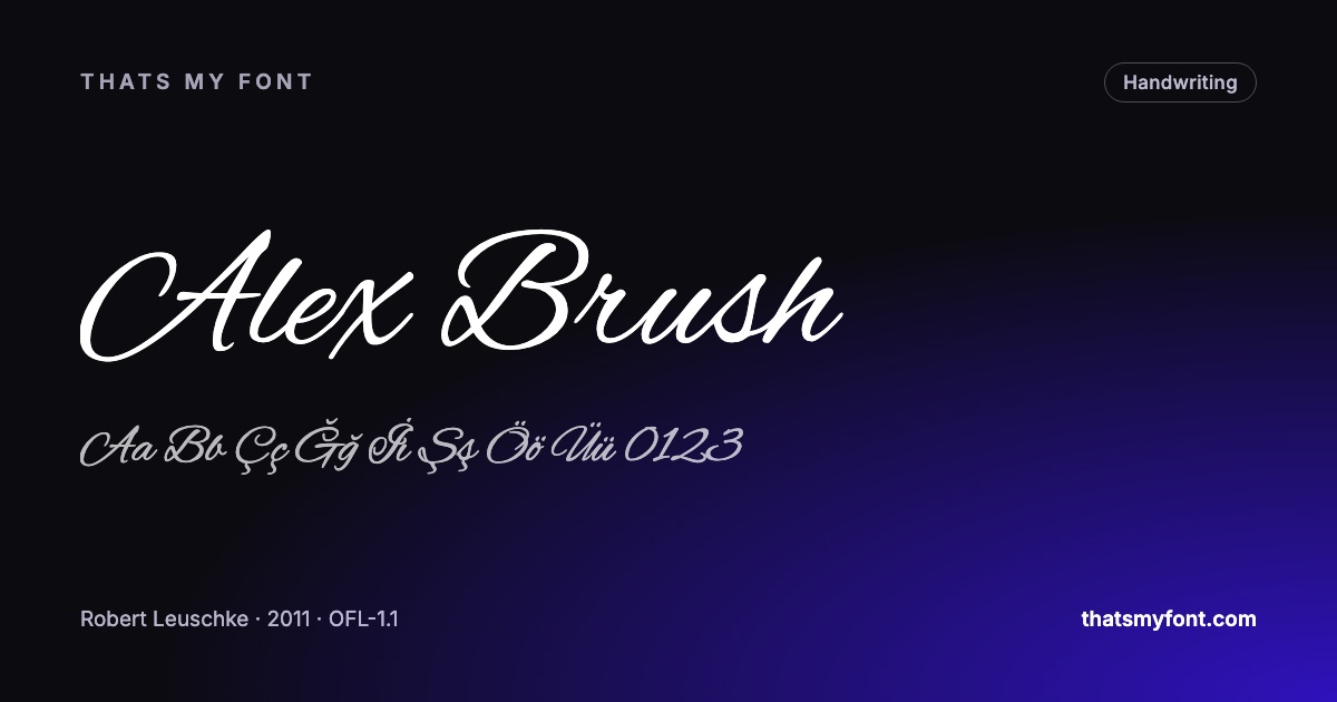
Script fonts look perfect on screen and fall apart on card. How to choose a script and its partner, and the three mistakes that make invitations hard to read.
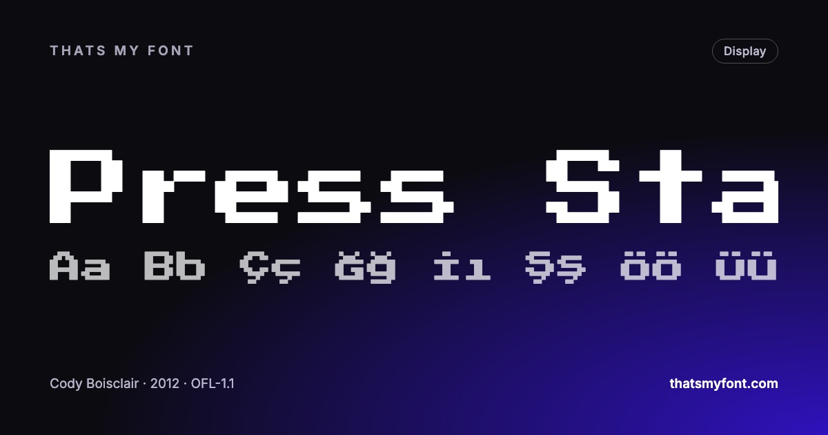
A pixel font drawn on a grid only stays crisp at exact multiples of that grid. The free faces worth using, and the sizes and settings that stop them blurring.
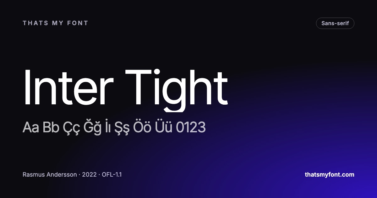
Three words for three kinds of space around letters, and the CSS property that controls each one. With the values that work and the ones that make text worse.
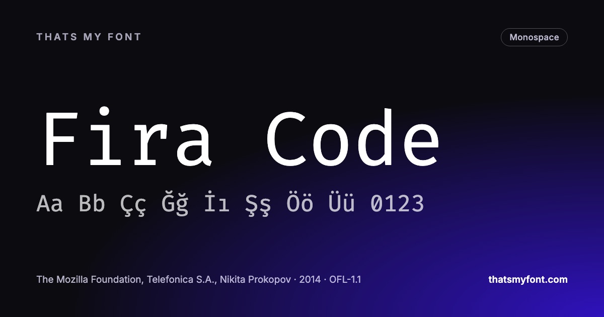
Some coding fonts merge operators like != into one symbol. What that changes, what it does not, and the one setting in each editor that switches it on or off.
Readability is measurable, and most of it is not the typeface. What the research supports, what it does not, and the free fonts built for readers who struggle.
Sixteen pixels is the default for good reasons, but the same number looks different in every typeface. How to pick the size, the unit and the line length together.
The same font, four platforms, four different places to put it. What each one accepts, where the upload lives, and the setting that catches people out on every one of them.
The licence covers the font file, not the shapes you make with it. You can trademark a logo set in an open font. Here is what that does and does not give you.
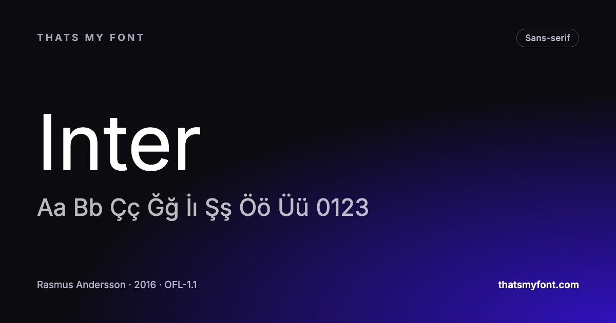
An interface font is judged on things a specimen never shows: the 1 against the l, the numbers in a table, and whether 13 pixels still holds together.
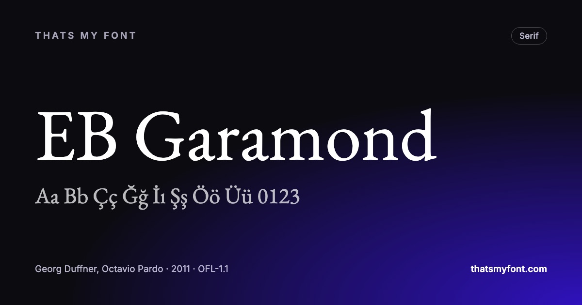
Ink spreads, pixels do not. The face that looks crisp on your monitor can close up on paper, and the fix is decided before the file goes to the printer.
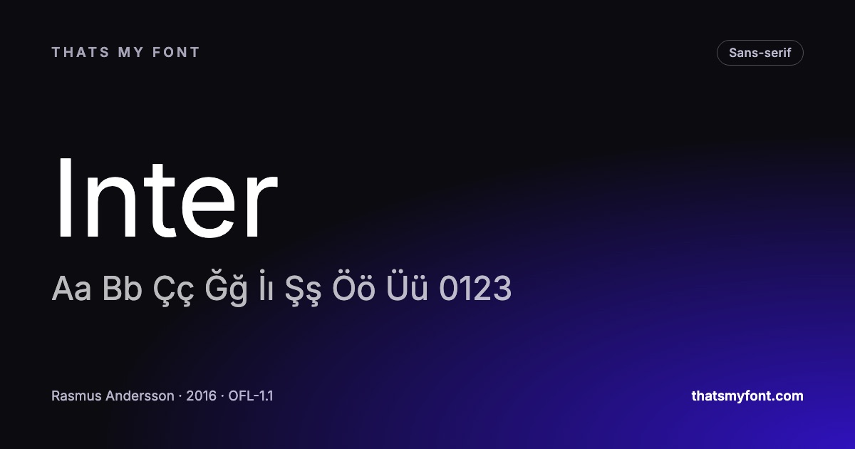
Desktop, web, app and broadcast are four separate licences, and the one you own probably is not the one the project needs. What to check before the invoice.
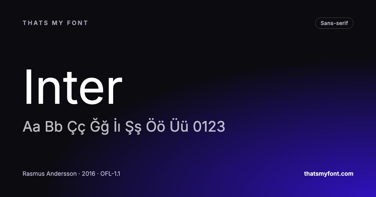
Half of CVs are parsed by software before a person sees them. The typographic decisions that break that parsing are small, specific and easy to avoid.
A Latin face with a few Cyrillic glyphs bolted on is obvious to anyone who reads it. What proper coverage means, and how to check before you commit.
Glyph count is the number nobody checks until an accent turns into a rectangle. What it measures, what it does not, and when a big number is meaningless.
Identification tools fail on the cases that matter. What to look at instead — five letters that give a typeface away, and where to look them up.
The research does not say one is more readable than the other. What decides it is the size, the screen and what the page is supposed to feel like.
There are 1,800 of them and you will use about twelve. Which twelve, and the question each one answers, rather than a gallery with no reasoning attached.
Canva takes TTF and OTF, one weight per upload, and quietly ignores most of a variable font. The workaround takes two minutes once you know it.
The second name in your font-family is what visitors see for the first few hundred milliseconds. Almost nobody chooses it, and it is why pages shift.
One file, nine weights, and your page renders one of them. The cause is nearly always a single line of CSS, and the other causes are a short list.
Every pairing article is a gallery of combinations somebody liked. Here is the reasoning underneath them, so you can judge a pair yourself rather than borrowing one.
Most sites download three alphabets to draw one. Subsetting removes the characters you will never set, and it is the single largest saving available on a web font.
A font can cover Latin and still ruin Turkish text. The dotless i is the tell, and "supports Latin" on a download page is not an answer to the question.
Most lists name any grotesque and hope. The differences that decide whether a substitution reads as Helvetica are specific and small, and there are only a few faces that get them right.
Fonts are usually the second heaviest thing on a page and the one nobody measures. Four decisions account for almost all of it, and three of them are free.
Three lines of CSS, one file, and no request to Google. What self-hosting actually involves, why it is now the faster option, and the two settings that decide whether your text flashes.
A German court fined a site owner in 2022 for loading a font from Google’s servers. What the ruling actually said, how far it reaches, and the fix that takes ten minutes.
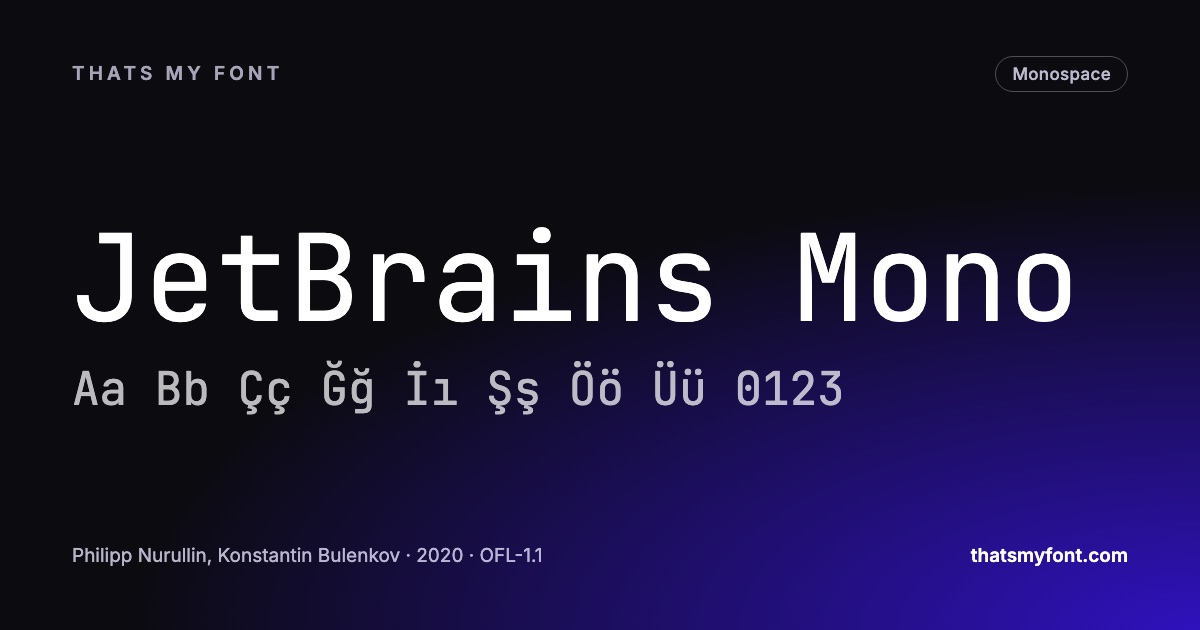
Every character the same width is the easy part. What actually separates a good coding font from a bad one is whether you can tell a zero from a capital O at two in the morning.
Four extensions, one thing underneath, and one of them is not like the others. What each format is, which to use where, and why TTF to OTF is not the simple job converters claim.
You can sell work made with it, put it in a logo, and never credit anybody. There is one thing you may not do, and a second that catches people out. Both are short.
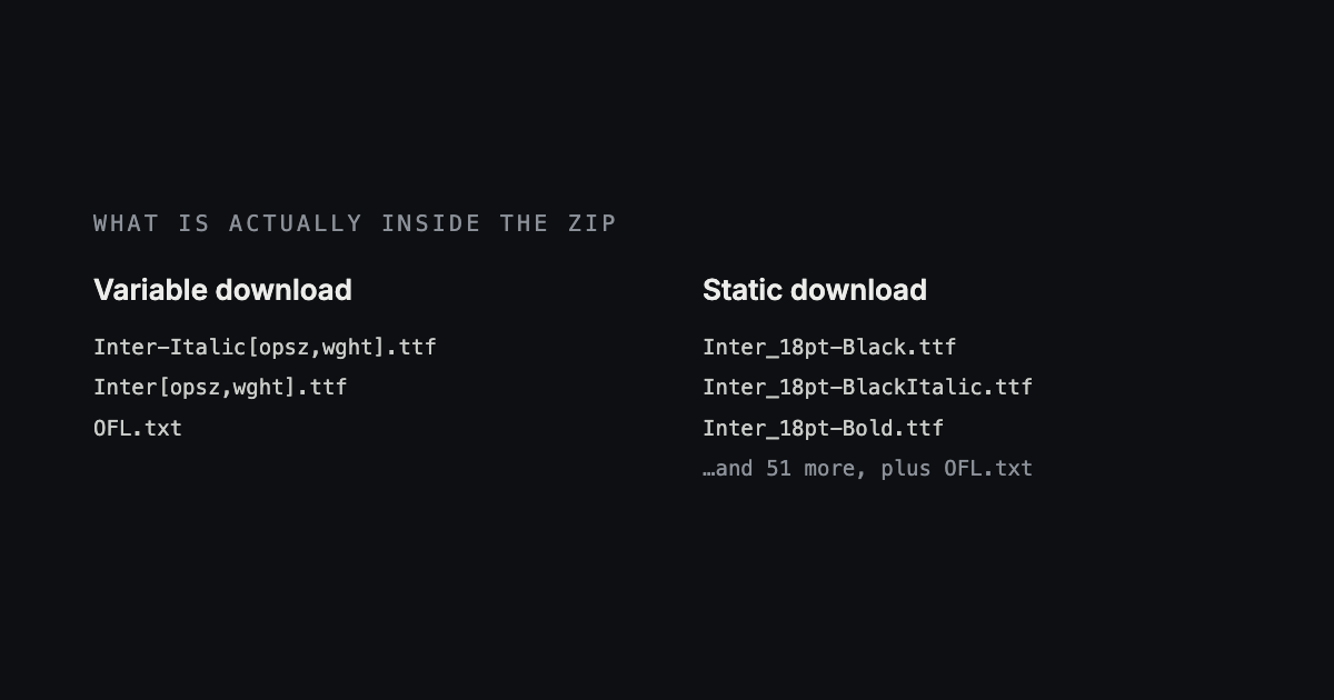
You have the zip and now you need the font to turn up in the program you actually work in. The steps for each, and what to do when it installs but never appears.
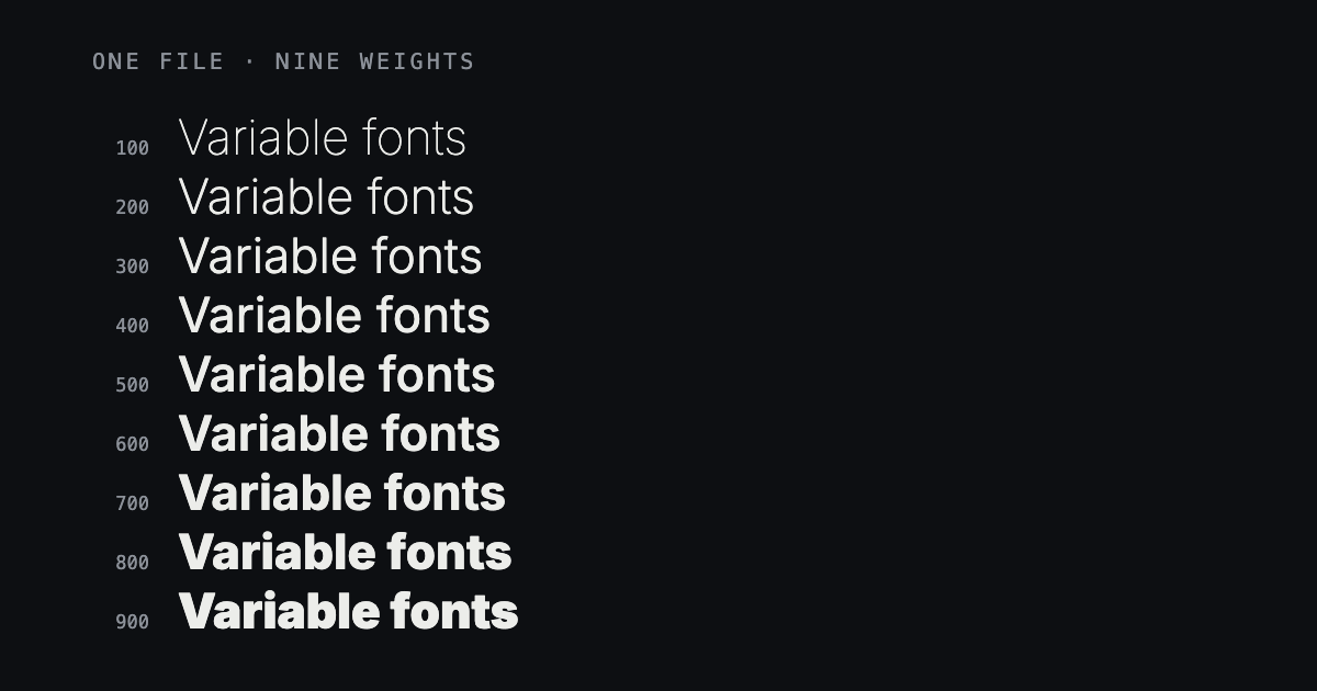
You downloaded a font and got one file instead of eighteen. Here is what a variable font actually is, where it works, where it quietly does not, and which of the two downloads to take.