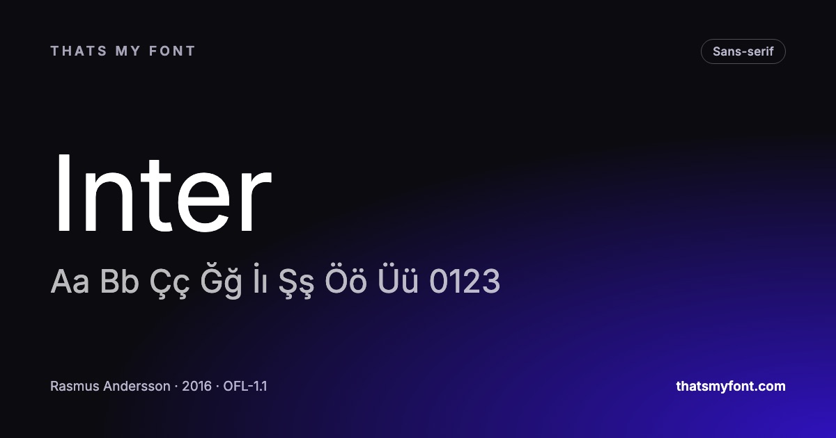
A serif is the small finishing stroke at the end of a letter’s stem. A sans-serif does not have them. That is the whole of the definition, and it explains almost nothing about which to use — the useful differences are elsewhere.
The readability claim, and what the research actually found
You will read that serifs guide the eye along the line and that sans-serifs are cleaner on screens. Both are repeated confidently and neither survives the studies. Decades of legibility research finds no reliable difference between well-made serif and sans-serif faces at reading sizes; what it does find is that familiarity and setting matter enormously.
So the choice is not about which is easier to read. It is about what the text is doing.
Where it does make a difference: size
Serifs are small details, and small details need pixels. At interface sizes — 13 to 15 pixels — a serif face with any real contrast between thick and thin starts to break up, while a sans holds its shape. That is a genuine, physical reason interfaces converge on sans-serifs, and it has nothing to do with reading speed.
Above about 16 pixels on a modern display the constraint disappears, which is why serif faces drawn for screens — Lora, Merriweather, Source Serif 4 — work perfectly well for articles.
And the part nobody admits: what it signals
A serif reads as established, considered, printed. A sans reads as current, plain, functional. Those associations come from where each has been used for the last century rather than from anything in the shapes, and they are no less real for that. A law firm in a geometric sans and a technology startup in a Didone both read as slightly wrong, and the reason is entirely cultural.
What actually decides it
- How small is the smallest text? Under 15 pixels, lean sans.
- How long is the longest passage? Both work; pick the one with a large lowercase and open letters.
- Print or screen? Print removes the size constraint entirely.
- What should it feel like? This is the real question, and it is the one you can answer honestly in a word.
| Family | Variable download | Static download |
|---|---|---|
| Inter | 957 KB2 files | 9.1 MB54 files |
| Lora | 224 KB2 files | 555 KB8 files |
| Source Serif 4 | 989 KB2 files | 6.0 MB64 files |
| Work Sans | 341 KB2 files | 1.5 MB18 files |
The answer is often both
A serif for headings and a sans for body, or the reverse, is the oldest working pairing there is, and it works because the contrast is categorical rather than a matter of degree. The pairing guide has the method.
What actually changed: screens got better
Most of the "sans-serif is more readable on screen" advice was written when a screen had about 100 pixels per inch and a serif at 14px was four or five pixels wide at the stem with nothing left over for a serif. Hinting — instructions inside the font that snap outlines to the pixel grid — existed precisely because of that, and it was the difference between a legible page and a smear.
A current phone has three times that density and hinting barely matters any more. A serif at 16px on a modern display renders its serifs cleanly, which is why serious reading sites went back to serifs for body text while their interfaces stayed sans. The old rule survived the condition that produced it.
Where the two categories stop being opposites
The line is blurrier than the labels suggest. A slab serif has serifs as heavy as its stems and behaves like a sans in a headline. A humanist sans takes its proportions from written letterforms, so its skeleton is closer to an old-style serif than to a grotesque. The useful question is not "does it have serifs" but "what is the skeleton underneath, and how much contrast is there between thick and thin".
That is why this site files faces by how they are drawn as well as by category: geometric, humanist, grotesque, old-style, transitional, didone, slab. Two of those terms will tell you more about how a face behaves in a paragraph than the word "serif" ever will.
A four-question test for the page in front of you
- How long will the reader be here? Ten seconds of navigation and ten minutes of an article are different jobs, and the second one rewards a face with more character.
- How small does it get? Below about 14px, ample counters and a large lowercase matter far more than the presence of serifs.
- What is above it? A serif heading over sans body reads as editorial; the reverse reads as a product. Both are fine, but pick one deliberately.
- Does the subject have a period? A transitional serif says considered and slightly old; a geometric sans says modern and slightly cold. The reader registers that before the first word.
When the answer is genuinely unclear, set the same paragraph in both and read it rather than looking at it. The compare tool will put a serif and a sans side by side at the same size, and the face that tires you least by the third line is usually the right one.
When the brand guidelines say one and the page needs the other
Guidelines are usually written for print and then applied to a screen, which is how a delicate serif ends up as the body face of a dashboard. The compromise that survives both is to keep the brand face where the brand is seen — headings, the front page, campaign work — and set the functional text in something chosen for its job.
Say so explicitly in the guidelines rather than doing it quietly: "the display face is X; interface text is Y at 14px and above" is a sentence that prevents a year of arguments. If the two have to look related, pick the interface face from the same classification — a transitional serif pairs with a humanist sans far more comfortably than with a geometric one.