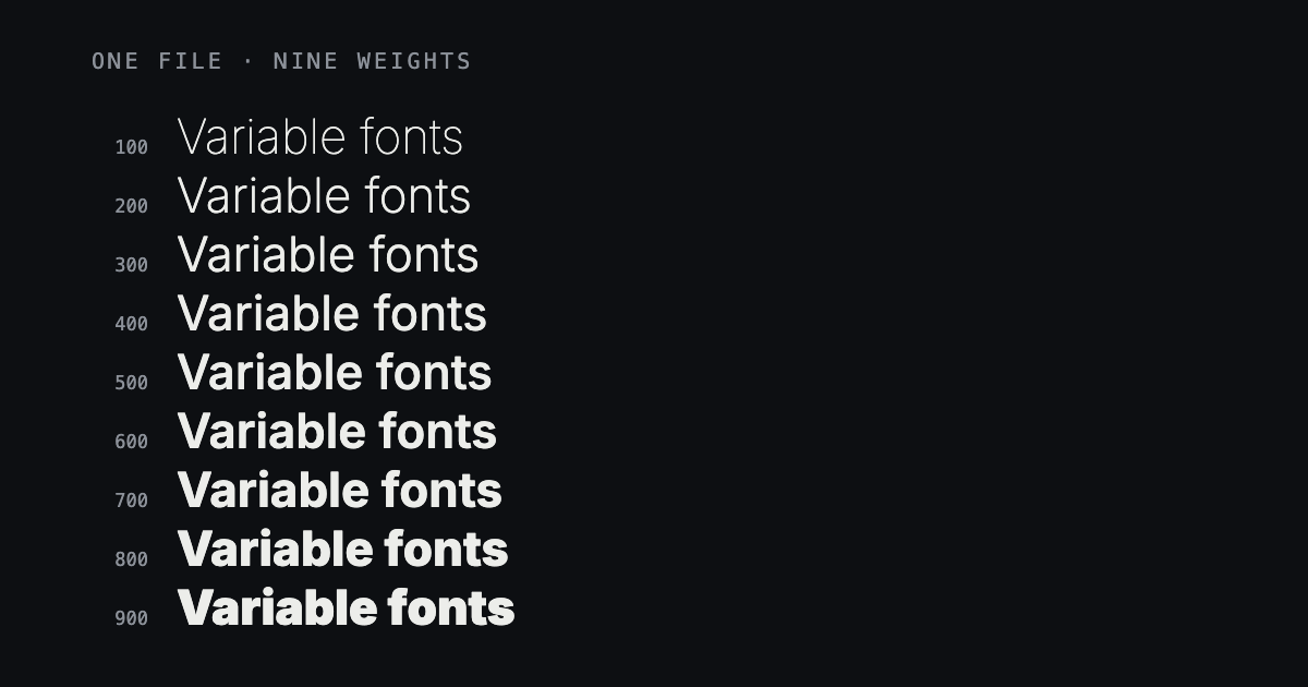
You downloaded a font from this site and got one file where you expected nine. Or you installed it, opened Word, and only Regular is in the menu. Those are the same thing seen from two sides: you have a variable font, and the software you opened it in either understands that or does not.
A static font is one file per weight. Light is a file, Regular is a file, Bold is a file. IBM Plex Mono is packaged that way: seven weights, roman and italic, fourteen files in the zip, and you install the ones you want. A variable font is one file that holds all of them at once — and every step in between — and lets the application ask for whichever it needs.
See it move
The line below is set in Inter, using the same preview file as the specimen on its font page. Drag the slider. Nothing is being downloaded and nothing is swapping in: the letterforms are being redrawn at each value by the one file already on this page.
Inter — variable
Sphinx of black quartz, judge my vow
In the static download
That is the whole idea. A static family gives you the stops. A variable file gives you the stops and the road between them, by interpolating between drawings the designer actually made. Weight 437 is not a smeared 400; it is a real point on a line that was defined deliberately.
The weight axis
Weight is the axis you will meet first, and for many families it is the only one. Inside the font it is called wght, it runs on the familiar 100-to-900 scale, and on the web you set it with font-weight — including values that were never a named style. font-weight: 437 is valid CSS. In a static font the browser falls back to one of the weights you shipped. In a variable font it renders exactly.
This is less academic than it sounds. With a static family, body text is 400 or it is 500. If 400 looks anaemic on a dark background and 500 looks heavy, there is no third answer. With a variable file you set 430 and move on. On a large heading, coming down from 700 to 660 is often the difference between confident and shouting.
Plenty of fonts have no axis at all. Bebas Neue is a condensed titling face drawn as exactly one thing: one weight, no italic, no variable version anywhere. Its download is a single small file that will install in anything ever made, and there is nothing to slide.
Bebas Neue — one weight
Sphinx of black quartz, judge my vow
The optical size axis
The second axis you are likely to meet is optical size, written opsz. It has nothing to do with making letters bigger — that is what font size does. It exists because a shape that reads well at 12px is the wrong shape at 60px.
Small text wants looser spacing, slightly sturdier thin strokes and more open counters, or it fills in and turns to mud. Large text wants the opposite: tighter spacing, finer hairlines, more contrast between thick and thin, because at that size the detail is the point. This is not a digital invention. A metal foundry cut 8pt and 48pt as physically different punches, and nobody thought of them as one font at two sizes.
Inter carries the axis, and reading it out of the file we actually serve, it runs from 14 to 32 with its default at 14. That default is worth knowing: software that ignores optical size gets the 14 drawing, the one meant for small text, even in a 72px headline. Merriweather goes much further — 18 to 144, alongside weight and a width axis — which is why it holds together as both a paragraph face and a poster face.
Where variable fonts quietly do not work
This is the part most articles skip, and it is the part that makes people think a download is broken. Support is not a matter of old versus new so much as design tools versus office tools.
- Fully supported: Figma, Illustrator, InDesign, Photoshop 2018 and later, Sketch, Affinity, and every current browser. You get a slider or a numeric field and the whole axis.
- One weight only: Microsoft Word, PowerPoint, Canva, Photoshop before 2018, and most older print workflows. The font installs without complaint and then offers Regular, because those applications read the default instance and stop there.
The second list is why many font pages here carry two buttons. The variable download is the file as the designer published it. The static download is the family's own per-weight files, packaged exactly as they were built — nothing is split apart on this end, because a font file that has been sliced up and renamed badly is worse than no file at all.
Where a page shows one button, either the family was never made variable, or no static build exists for it. Merriweather is the second case: with three axes, a static set would need a file for every combination of weight, width and optical size, and it runs to tens of megabytes. It is offered as the variable file alone.
Which one should you download
Be decisive about this. There is a right answer for almost every case.
- Designing in Figma, Illustrator, InDesign or current Photoshop: variable, always. One file, every weight, and axes you can actually reach.
- Building a website: variable. One request instead of five, a smaller total in almost every case, and any weight you like without shipping another file.
- Working in Word, PowerPoint or Canva: static. If a font has no static download, choose a different font for that job rather than fighting it.
- Sending artwork to a printer or handing files to a client: static, unless you have asked what they use and know the answer. A font that arrives somewhere it cannot be read looks like your mistake, not theirs.
- Not sure: take the variable file. If it turns up in your font menu offering only Regular, come back and take the static one.
Size, and why the web cares
A variable file is nearly always smaller than the static set it replaces, because the weights share one set of outlines instead of repeating them with small differences. The gap is not marginal.
| Family | Variable download | Static download |
|---|---|---|
| Inter | 957 KB2 files | 9.1 MB54 files |
| Work Sans | 341 KB2 files | 1.5 MB18 files |
| JetBrains Mono | 187 KB2 files | 892 KB16 files |
Be precise about what that comparison says, though. The variable file is smaller than the whole set. It is usually larger than any single static weight. If a site uses exactly one weight and never will use another, one static file is the lighter choice — and that is a real case, not a technicality. The moment you want two weights, the variable file wins, and it keeps winning with every weight after that.
On the web there is a second saving the table does not show: requests. Five weights are five files, five connections and five chances for one to arrive late and reflow a paragraph a reader is already looking at. A variable font is one file, one request, and every weight arrives at the same moment.