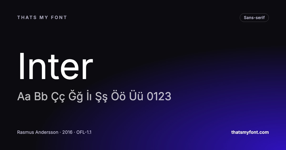
Every font page on this site shows a glyph count, and it is one of the few numbers here that is routinely misread. It is worth knowing what it counts, because it is the difference between a font that will set your text and one that will quietly substitute a different typeface halfway through a word.
Glyphs are not characters
A character is a thing in the text — the letter a. A glyph is a drawing in the font. They are usually one to one and often are not: a font can hold several drawings of the same letter for different contexts, and it can hold one drawing used for several characters.
So a face with 3,000 glyphs may not cover more languages than one with 800. It may simply have small capitals, several sets of numerals, and alternate letterforms — features that are valuable and have nothing to do with coverage.
Where the number comes from here
It is read out of the font file when the archive is built, not copied from a description. So is the list of alphabets on every page — the check looks for the actual characters each script requires and reports what it found. A font is listed as supporting Turkish because the dotless ı and the dotted İ are in the file, not because the family name suggests it. The Turkish post works through why that distinction matters.
The characters that catch people out
- Curly quotes and apostrophes. Straight quotes are basic Latin; the typographic ones are not, and a font missing them silently falls back mid-sentence.
- The en dash, em dash and ellipsis. Same story, and they appear in almost every piece of edited prose.
- Currency symbols beyond the dollar. The euro is usually there; the lira, rupee and won often are not.
- The degree sign, the multiplication sign, and the proper minus — all different characters from the ones on a keyboard.
- Accented capitals. Plenty of fonts carry é and not É, which only shows up in a headline set in title case.
What a missing glyph looks like
Either a rectangle — the "tofu" box — or, more often and more insidiously, the character rendered in a completely different typeface, because the browser fell through to the next family in your stack. The second is easy to miss on a screen and impossible to miss in print.
How to check before you commit
Every font page here has a character map showing exactly what the file contains — look rather than assume. Then set your own worst-case string in the preview: a name with an accent, a price with a currency symbol, a sentence with real punctuation. The Lorem Ipsum tool will do it at the size and measure you actually intend.
| Family | Variable download | Static download |
|---|---|---|
| Inter | 957 KB2 files | 9.1 MB54 files |
| Noto Sans | 2.5 MB2 files | 21.6 MB72 files |
| EB Garamond | 790 KB2 files | 2.2 MB10 files |
| Bebas Neue | None published | 30 KB1 file |
Display faces are where this bites hardest. A face like Bebas Neue is drawn for headlines and carries far less than a text face — which is entirely reasonable for what it is, and a problem if you discover it after the brand guidelines are printed.
Four levels of "supports this language"
The phrase covers four quite different claims, and the gap between them is where most disappointment comes from.
- The characters exist. Nothing renders as a box. This is the level a glyph count measures, and it is the weakest of the four.
- They are drawn properly. Accented capitals fit under the line rather than colliding with it; the Turkish dotless ı is a real letter rather than an i with the dot removed.
- Localised forms are there. The same character drawn the way a particular language expects — Bulgarian Cyrillic, Serbian italics, the Romanian comma-below rather than a cedilla.
- The features work. Marks position correctly in Arabic, conjuncts form in Devanagari, and the numerals line up in a table. This is where a font stops being a character set and becomes typography.
A font can pass the first and fail the fourth, which is why "it has 3,000 glyphs" is not an answer to "can I set my language in it".
Subsetting removes glyphs deliberately
If a font was complete when you downloaded it and is missing characters on your site, something cut it down on the way. That is usually a build step doing its job badly: a subsetter told to keep "Latin" will throw away Greek, Cyrillic and often the Turkish letters, and a page that later shows a Turkish name renders it in the fallback. The subsetting guide has the ranges to keep.
The web has a second, subtler version of the same thing. A unicode-range in your CSS tells the browser which characters a file is for; get it wrong and the browser will not use the file for the characters you left out, even though they are inside it. The symptom is identical to a missing glyph.
The ten-second check
Before committing a face to a project, paste the hardest string the project will ever contain into a specimen and look at it: a name with accents, a currency symbol, an ellipsis, a proper apostrophe, the arrows or maths signs the interface uses. If anything changes shape, weight or width mid-line, that character is coming from somewhere else.
Every font page on this site draws its character map from the font file itself rather than from a claim, so the letters shown are the letters you get. The alphabet filter in the archive does the same job across all the families here at once.
Currency, maths and arrows
After letters, the characters most often missing are the ones a design needs least often and most visibly. Currency signs beyond the dollar, euro and pound — the lira ₺, the rouble ₽, the rupee ₹ — appear in fonts drawn after those symbols were standardised and not before. Maths signs beyond the keyboard four, proper multiplication and minus, and the arrows used in interfaces are all commonly absent.
The result is the same as any missing glyph: that one character comes from another font and looks it. If the design depends on a symbol, check it in the character map on the font page before committing, exactly as you would check a letter.