Almost every article about font pairing is a list of pairs that somebody thought looked nice. The pairs are usually fine and the list is useless the moment your project needs something not on it. What is worth learning is the reasoning underneath, which is short.
The one rule: contrast or harmony, never neither
Two typefaces on a page either belong to the same world or are visibly from different ones. What fails is the middle: two faces similar enough that the difference looks accidental. A reader cannot tell whether you chose two things or made a mistake, and that uncertainty is the whole of why some pairings feel wrong without anyone being able to say why.
So the first question is not "do these go together" but "am I aiming for contrast or for harmony". Both work. Neither works badly.
Contrast: the reliable version
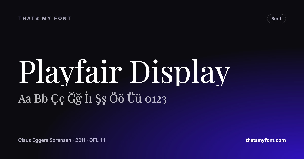
A serif for headings and a sans for body, or the reverse, is the oldest working pairing there is. It works because the difference is categorical rather than a matter of degree — nobody looks at Playfair Display above Inter and wonders whether it was intentional.
Contrast in weight is the same principle inside one axis: a heavy display setting over a regular body. Contrast in width, or between a display face and a plain one, does the same job. The requirement is only that the difference is obvious at a glance.
Harmony: the version with a shortcut
The safest harmony is a superfamily — one designer’s sans and serif drawn together, sharing proportions and x-height. IBM Plex Sans with IBM Plex Serif, or Source Sans 3 with Source Serif 4. The pairing question has already been answered by the person who drew both, which is why these are hard to get wrong.
The other harmony worth knowing is one typeface used at two very different weights and sizes. It is not a pairing at all, technically, and for a great many projects it is the right answer — the discipline reads as confidence rather than as a limitation.
The two things to check before committing
X-height
The height of the lowercase relative to the capitals is what makes two faces set at the same size look like different sizes. Two faces with very different x-heights need their sizes adjusted against each other, and if you do not the body text will look either shrunken or oversized under the heading. Set them side by side at the same value and look at the lowercase before you decide anything else.
Mood, said out loud
A geometric sans is neutral and slightly cold. A humanist sans is warm. A Didone is formal and expensive. A slab is sturdy and a bit blunt. Two faces whose moods contradict each other will fight regardless of how well their proportions match — and naming the mood in a word is usually enough to notice the contradiction before you have built the page.
Pairings worth starting from
Not because they are the only ones, but because each demonstrates one of the principles above. Playfair Display over Inter is categorical contrast. Lora over Work Sans is the same idea at lower volume, for something that has to be read rather than admired. Space Mono over Inter is contrast by category rather than by style, and it is why so many technical sites look the way they do.
| Family | Variable download | Static download |
|---|---|---|
| Playfair Display | 270 KB2 files | 1.0 MB12 files |
| Inter | 957 KB2 files | 9.1 MB54 files |
| Lora | 224 KB2 files | 555 KB8 files |
| Work Sans | 341 KB2 files | 1.5 MB18 files |
| Source Serif 4 | 989 KB2 files | 6.0 MB64 files |
How to test a pair in two minutes
Set a real heading and a real paragraph — your own words, not filler — at the sizes you will actually use, and look at them small. Most pairings that fail, fail at body size rather than in a specimen. The Lorem Ipsum tool here will set any font in this archive at a chosen size inside a frame you can drag to the width of your real column, which is the part a specimen cannot show you.
Then leave it and come back. A pairing that still looks deliberate an hour later is a pairing. One that has started to look like an accident was always going to.
Three pairings that fail for predictable reasons
- Two humanist sans-serifs. Close enough to look like a mistake rather than a decision — the reader cannot tell whether the second one is meant to be different.
- Two serifs from the same period. Same problem, with more detail to argue about. A transitional over an old-style reads as one font rendered badly.
- Two display faces. Both are shouting, and neither has anything to be loud against. A display face needs a quiet partner or it has no effect at all.
The common thread is that contrast has to be obvious at a glance. If a reader has to compare the two to see they are different, the pairing is doing nothing except costing a font file.
Setting the pair once you have chosen it
Two faces at the same point size are rarely the same visual size, because their lowercase heights differ. Matching them is the adjustment that makes a pairing look intentional: set the heading and the body together, then nudge one size until the lowercase letters look the same height, not the same number.
- Match the lowercase height by eye, adjusting the point size rather than the family.
- Give the pair a weight gap. A regular heading over a regular body is two fonts with no hierarchy; go up at least two steps.
- Keep the spacing settings separate. A display face often wants tighter tracking than the body text it sits above.
- Check them at the smallest size the design uses, not just at the heading size — that is where a delicate partner falls apart.
When the deadline is today
Use a superfamily and stop thinking about it. IBM Plex, Source, Noto and Fira each publish a sans, a serif and a monospace drawn to the same proportions, so the pairing is already resolved by the person who drew both. IBM Plex Sans over IBM Plex Serif is a complete type system in two downloads, and the compare tool will show them in your own words before you commit.