A monospace font gives every character the same width. That is the definition and it is also the least interesting thing about choosing one, because every font in this category does it. What separates them is a much narrower question: when you are tired and the code is dense, can you tell the characters apart?
There are three characters that decide it, and they are the same three every time.
Zero against capital O
The most common fix is a slash or a dot inside the zero. JetBrains Mono and Source Code Pro both do this. Some faces instead make the zero narrower or more oval than the O, which works but takes longer to learn. A face that does neither is not a coding font, whatever it says on the tin.
Lowercase l against capital I against the digit 1
This is the trio that produces the bug you stare at for twenty minutes. The good solutions are a tailed l, a serifed I, and a 1 with a full base. IBM Plex Mono gives the l a curved exit and the I proper crossbars, which makes the three of them unmistakable at any size.
Punctuation you can see
Braces, brackets and parentheses need to be distinct from each other at a glance, and the difference between a comma and a full stop and a semicolon has to survive at 12 pixels on a display you did not choose. This is where faces drawn for typography rather than for code tend to fall down: their punctuation is beautifully proportioned and far too small.
The families worth trying first
These are the ones that solve all three problems deliberately. Every one of them is free for commercial use, and the numbers below are read from the actual files rather than from a marketing page.
| Family | Variable download | Static download |
|---|---|---|
| JetBrains Mono | 187 KB2 files | 892 KB16 files |
| IBM Plex Mono | None published | 835 KB14 files |
| Source Code Pro | 211 KB2 files | 1017 KB16 files |
| Fira Code | 138 KB1 file | 481 KB5 files |
| Roboto Mono | 267 KB2 files | 789 KB14 files |
| Inconsolata | 186 KB1 file | 3.6 MB72 files |
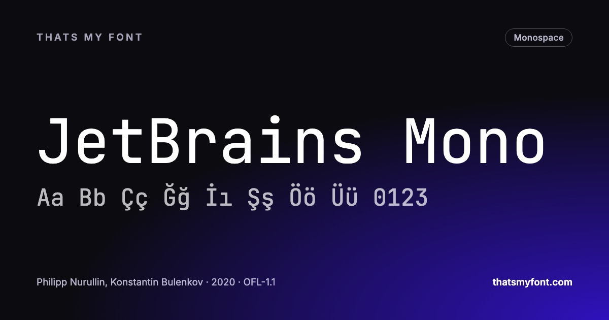
JetBrains Mono was drawn specifically for reading code and has the tallest lowercase of the group, which is why it looks larger than other faces at the same point size. Fira Code is the one that popularised programming ligatures. IBM Plex Mono is warmer than most coding faces because it was drawn as part of a family rather than for terminals alone. Inconsolata is the oldest of them and still one of the most legible at small sizes.
Ligatures: a real decision, not a feature
Some of these faces draw a single arrow when you type a hyphen and a greater-than sign, or a proper not-equals when you type an exclamation mark and an equals. People are genuinely split on it. It makes operators easier to scan and it makes the characters you actually typed harder to count, which matters when you are debugging a regular expression.
It is worth knowing that this is a setting in your editor rather than a property of the font you are stuck with. Turning ligatures off in a face that has them gives you the plain characters back.
Monospace outside code
A monospace face is a strong editorial voice, not a neutral one. It reads as technical, documentary, provisional. That is useful for captions, data tables, tickets, timestamps and any interface where numbers change and you want the columns to stay still. It is tiring in a paragraph: the even spacing that keeps a column honest is exactly what makes a sentence feel typed rather than written.
How to actually choose
Do not choose from a specimen of the alphabet. Paste real code — your own, with your own bracket habits — into the preview box on a font page, set it to the size you actually work at, and read it. Then use it for a full day. The differences that matter are the ones that only show up over hours, and no amount of looking at ABCDEFG will surface them.
Every family here offers a WOFF2 download if you want it in a web-based editor, and the full monospace category has considerably more than the six above.
Size, line height and how many columns fit
A coding font is read for six hours at a time, which makes the settings around it as important as the face. Most editors default to something a little tight for a long day.
- Size: 13 to 15px on a laptop, 14 to 16 on a large monitor. Bigger than it sounds, and the first thing to raise when your eyes tire in the afternoon.
- Line height: 1.4 to 1.6. Editors often ship at 1.2, which packs more code on screen and makes it harder to track a line across indentation.
- Column width: 80 to 120 characters. A narrow face fits more without shrinking the type, which is the practical argument for the narrower families.
- Weight: the regular. Light weights on a dark theme lose their stems to the background.
Terminals are a different problem
A terminal renders a strict grid of cells, and it is stricter about what a font may do inside one. Ligature support varies from full to none; some terminals render bold as a different font rather than a weight; and box-drawing characters, progress bars and prompt symbols have to line up exactly or the interface looks broken.
If your prompt uses the powerline-style arrows or icon glyphs, those characters come from a patched build of a font rather than from the font itself. Patching is allowed by the licences here — they permit modification — but the patched file is a derivative that must keep the same licence and, where the family has a reserved name, a different name.
Italics worth having
Most monospaced families have an italic that is the upright slanted a few degrees. Two in this archive draw a genuine cursive instead: Victor Mono and Cascadia Code. With an editor theme that italicises comments and keywords, the effect is that prose-like parts of the file look like handwriting against the upright code — which sounds decorative and turns out to be a genuine navigation aid.