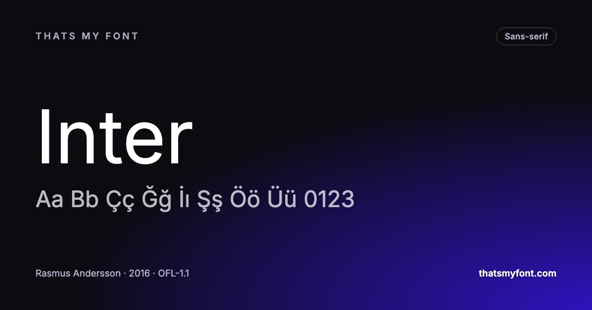
Turkish is written in the Latin alphabet, which is exactly why this goes wrong so often. A font advertises Latin support, you set a headline in it, and the ı comes out with a dot on it, or the ğ is missing entirely and a rectangle appears in its place.
The characters Turkish needs beyond plain Latin are a small list, and a font either has them or it does not.
- ı and I — the dotless lowercase i and its capital.
- i and İ — the dotted lowercase i and, crucially, the dotted capital.
- ğ and Ğ — the soft g.
- ş and Ş — the s with a cedilla.
- ç, Ç, ö, Ö, ü and Ü — shared with several other languages and usually present.
The capital İ is where fonts fail
Most fonts drawn for English have a dotless capital I, because in English that is the only capital I there is. Turkish has two: İ with a dot and I without. A font missing the dotted capital will either show nothing or fall back to a different typeface for that one letter, and in a headline that is immediately visible.
The lowercase side has the mirrored problem. Software that lowercases text without knowing it is Turkish turns I into i rather than into ı, which changes words. That is a text-processing bug rather than a font one, but it is the same underlying confusion.
How this site answers the question
Every font page here lists the alphabets that font covers, and those lists are not copied from anywhere. They are read out of the font file’s own character map when the archive is built. If a page says a font supports Turkish, the dotless ı and the dotted İ were found in the file itself. If it says a font does not, they were not there.
That distinction matters because "supports Latin" is technically true of almost every font in existence and tells you nothing. Every font page carries a row of the alphabets it covers, with Türkçe marked in bold where the check passed, and the archive can be filtered by alphabet to show only the families that cover it.
Faces worth starting from
Inter and Roboto both cover Turkish thoroughly and were drawn for screens, which makes them safe defaults for interfaces. For text on a page, Lora and Merriweather are serif faces with the full set. Host Grotesk is worth knowing about specifically here: it came out of an Istanbul foundry, so the Turkish characters were drawn as part of the design rather than adapted afterwards, and it shows in how the dotless ı sits against the dotted i.
| Family | Variable download | Static download |
|---|---|---|
| Inter | 957 KB2 files | 9.1 MB54 files |
| Roboto | 597 KB2 files | 5.2 MB54 files |
| Lora | 224 KB2 files | 555 KB8 files |
| Merriweather | 6.2 MB2 files | None published |
| Host Grotesk | 90 KB2 files | 385 KB12 files |
How many free fonts actually carry Turkish
Because every font in this archive is checked the same way, the archive itself is a fair sample of what free fonts do with Turkish. The table below is counted from the font files each time the site is built, so it moves as fonts are added.
| Category | Fonts | Carry Türkçe | Share |
|---|---|---|---|
| Sans-serif | 118 | 110 | 93% |
| Serif | 76 | 66 | 87% |
| Display | 66 | 50 | 76% |
| Monospace | 40 | 36 | 90% |
| Handwriting | 37 | 28 | 76% |
| All fonts | 337 | 290 | 86% |
The pattern is consistent. Faces drawn for reading — the sans and serif families meant for paragraphs — almost always have the full set, because they are drawn for a wide range of European languages from the start. The gaps are in display and handwriting faces, where a design drawn for English headlines often stops at the letters English needs.
The letter that goes missing first is not the one people expect. Among the fonts here that cover the accented letters of most European languages and still fail Turkish, almost every one is missing the dotted capital İ — and most are missing ş and ğ as well. The dotless ı, the famous one, is usually there. That is the reason to test with a sentence in capitals, not just in lowercase.
How to check a font yourself
Do not test with the alphabet. Type a sentence that uses the characters: Işık ılık süt için Ğğ Şş contains every one of them, in both cases. Paste it into the preview box on any font page here, or into whatever tool you are using, and look at it at the size you will actually set it.
Two failures to watch for. A missing glyph usually shows as a rectangle or as a letter in a visibly different typeface. A wrong glyph is subtler and worse: an ı that has quietly been substituted with an ordinary i looks almost right and is not.
The character map on every font page here shows exactly which characters the file contains, so you can look rather than guess. It is the same data the alphabet list is derived from.
Where Turkish breaks in software, not in the font
The most frequent Turkish bug has nothing to do with which letters a font contains. Ask a browser to uppercase "istanbul" and it produces "ISTANBUL" — the dotted capital İ only appears if the text declares that it is Turkish. In HTML that is lang="tr" on the element, and with it text-transform: uppercase produces "İSTANBUL" correctly.
- Set the language on the element, not only on the page, when a page mixes Turkish and English.
- The same rule governs lowercasing: I becomes ı in Turkish and i everywhere else.
- Sorting and searching have the same trap in databases and spreadsheets, where a Turkish collation has to be chosen explicitly.
- Autocorrect in office software frequently "fixes" ı into i. Turn it off before typing a long document.
The rest of Turkish typography
Once the letters are there, three details separate type that looks Turkish from type that looks translated. Quotation marks are the same as English ones in modern practice, but the lira sign ₺ is recent enough that plenty of fonts are missing it. Line height needs a little more room than an English setting, because İ, Ğ and Ş all reach above the cap height or below the baseline.
And hyphenation is worth switching on: Turkish words are long, and a justified column without hyphenation opens gaps that make the page look badly set. The spacing side of that is covered in kerning, tracking and leading.
| Category | Fonts | Carry Türkçe | Share |
|---|---|---|---|
| Sans-serif | 118 | 110 | 93% |
| Serif | 76 | 66 | 87% |
| Display | 66 | 50 | 76% |
| Monospace | 40 | 36 | 90% |
| Handwriting | 37 | 28 | 76% |
| All fonts | 337 | 290 | 86% |