Choosing type for an interface is a different job from choosing it for a brand. Nobody admires an interface font; they read four hundred labels a day in it without noticing. What that rules out is most of what a specimen shows you, and what it rules in is a short list of properties you can actually check.
The characters that decide it
An interface is full of identifiers, order numbers, versions and codes, and it is read in a hurry. The lowercase l, the capital I and the digit 1 have to be distinguishable from each other, and the zero from a capital O. A face that fails this is fine for a headline and a liability in a settings screen.
Test it with a string rather than the alphabet: Il1 O0 rn m contains every confusable pair including the r-n that reads as an m at small sizes. Paste it into the preview box on any font page here at the size you actually ship.
Numbers that line up
Anything with a table, a price column or a live counter needs tabular figures — numerals of equal width, so a value changing from 1 to 8 does not shift the column. Many families include them as an OpenType feature rather than as the default, switched on with font-variant-numeric.
The related trap is old-style figures, which hang below the baseline like lowercase letters. They are beautiful in running text and wrong in a data table.
It has to survive 13 pixels
Interface text is smaller than anything else you set. What holds up at that size is a large lowercase relative to the capitals, open apertures, and moderate contrast between thick and thin strokes. What falls apart is high contrast and tight apertures, which is most of what makes a face interesting at display size.
This is why so many interfaces converge on the same handful of faces. It is not a failure of imagination; the constraints are narrow and they point the same way.
Enough weights, in one file
An interface needs a hierarchy — label, body, emphasis, heading — which means at least three weights, and a variable font carries all of them in one file at less than the size of three static ones. It also lets you use a weight between the named ones when 500 is right and 400 is thin. See the variable font post.
The faces that meet all of it
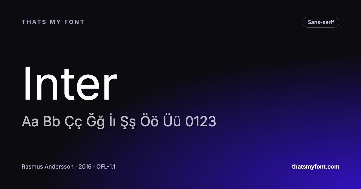
Inter was drawn for this exact problem and is the default answer for good reasons: a tall lowercase, disambiguated characters, tabular figures, and an optical size axis. IBM Plex Sans is the option when an interface should not look like every other interface — it is engineered rather than neutral, and it comes with a matching serif and mono for documentation. Public Sans was made for US government services, which is a brief with legibility requirements attached. Manrope is the same job with more personality, at some cost in neutrality.
| Family | Variable download | Static download |
|---|---|---|
| Inter | 957 KB2 files | 9.1 MB54 files |
| IBM Plex Sans | 637 KB2 files | 4.8 MB42 files |
| Public Sans | 109 KB2 files | 588 KB18 files |
| Manrope | 69 KB1 file | 292 KB7 files |
| Work Sans | 341 KB2 files | 1.5 MB18 files |
And the boring part that matters most
Whatever you choose, serve it as a WOFF2 from your own domain, cut to the alphabets you actually ship. Interface text is the first thing a user sees and a font that arrives late is a screen full of fallback that reflows a moment later. How much fonts cost your page speed has the numbers.
The type scale, and why five sizes is enough
Interfaces do not fail because the typeface was wrong; they fail because there are eleven text sizes and no rule about which one means what. A product needs about five, each with a job: a page title, a section title, body, a secondary line, and a label.
- 12px for labels and legal text, and nothing smaller.
- 14px for secondary text: timestamps, helper lines, table cells in a dense view.
- 16px for body text, which is also the size that stops iOS zooming a form field when it is tapped.
- 20px for section headings.
- 24 to 32px for the page title, depending on how dense the product is.
Line height goes the other way: around 1.5 at 14 and 16px, tightening to 1.2 at the two heading sizes. If a design needs a sixth size, the usual cause is that two things are competing for the same level of the hierarchy.
Dark mode wants a lighter weight
Light text on a dark ground looks heavier than the same weight does the other way round: the bright strokes bleed outward against the dark, which is an optical effect rather than a rendering bug. A 500 that is right on a white page reads as a 600 on a dark one.
The fix is one line of CSS in the dark theme, and a variable family makes it painless — drop the body weight by 25 to 50 units rather than switching family. Some faces carry a grade axis, which changes the weight without changing the width of the letters, so nothing reflows when the theme changes. Roboto Flex is the one in this archive with the most axes to play with.
The languages the product will actually ship in
Interface copy gets translated, and the translation is where a typeface chosen on English alone falls over. German compounds make labels a third longer, Turkish needs ı, İ, ğ and ş, and Cyrillic or Greek double the character set. Choosing a family that already covers them costs nothing now and saves a rebuild later.
| Category | Fonts | Carry Türkçe | Share |
|---|---|---|---|
| Sans-serif | 118 | 110 | 93% |
| Serif | 76 | 66 | 87% |
| Display | 66 | 50 | 76% |
| Monospace | 40 | 36 | 90% |
| Handwriting | 37 | 28 | 76% |
| All fonts | 337 | 290 | 86% |
Every font page here lists the alphabets the file really contains, measured from its character table, and the archive can be filtered by alphabet directly. If the product ships in one language today and three next year, that filter is the cheapest decision on this page.
Handing the font to the people who build it
A typeface chosen in a design file is not yet a typeface in the product. What the engineers need is short and specific: which file, which weights, which formats, and where it is served from.
- The variable file, and the italic if the design uses one — not the twelve static weights from the download.
- The exact weights the design system uses, as numbers, so nobody has to guess what "medium" meant.
- WOFF2 for the web, and the .ttf for anyone building the native apps.
- The licence text, kept with the files. Every family here permits all of this, which is the reason it takes one paragraph rather than a procurement process.