Most designers now work almost entirely on screens, and then a project needs a printed piece. The type decisions that were safe stop being safe, for reasons that have nothing to do with taste.
Ink spreads. Pixels do not.
On paper, ink bleeds very slightly into the fibres. Fine strokes get a little heavier, counters get a little smaller, and the tighter the space between strokes the more it closes. On uncoated stock the effect is pronounced; on newsprint it is dramatic.
The practical consequence is that a face which looks delicate and precise on a monitor can come back from the printer looking heavier and muddier than you designed. Faces with very high contrast and small counters are the ones this catches.
Resolution reverses the size constraint
A screen gives a letter maybe 15 pixels of height at body size. Print gives it hundreds of dots. Everything that makes a face unusable at interface sizes — fine serifs, high contrast, delicate detail — works perfectly in print, which is why the traditional book faces are traditional book faces.
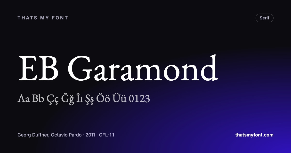
So a serif you rejected for a website may be exactly right on paper. EB Garamond and Libre Baskerville are drawn from designs cut for metal and behave accordingly.
Screen-first faces in print
The reverse also holds and is less discussed. A face drawn for screens — sturdy serifs, large lowercase, generous spacing — can look slightly heavy-handed on paper, the way a road sign does close up. Merriweather is superb on a phone and noticeably robust in a book.
| Family | Variable download | Static download |
|---|---|---|
| EB Garamond | 790 KB2 files | 2.2 MB10 files |
| Libre Baskerville | 166 KB2 files | 464 KB8 files |
| Merriweather | 6.2 MB2 files | None published |
| Lora | 224 KB2 files | 555 KB8 files |
The four practical rules
- Set body text smaller than you would on screen. Print body text is typically 9 to 11 point; the same measurement on a monitor would be unreadable.
- Give it more line spacing than the software’s default, and set the measure narrower — 60 to 70 characters is comfortable on paper too.
- Proof at actual size on the actual stock before signing anything off. A laser proof on office paper does not tell you what uncoated will do.
- Check the licence covers what the printer will do with the file. An open licence does; a desktop licence bought for one seat may not cover the printer’s.
One thing that is genuinely the same
Hierarchy. The relationships between heading, subheading and body do not change between media, and if the hierarchy works on screen it will work on paper. It is only the physical constraints that move.
Black is not black, and small type pays for it
On a screen, text is one colour. In print it is four inks, and each one is laid down by a separate plate. Body text set in "rich black" — black with cyan, magenta and yellow behind it — needs those plates to line up perfectly, and at 9pt they do not: the edges of the letters show a coloured fringe. Small text is set in 100% black alone, and nothing else.
The same arithmetic applies to reversed type. White text on a four-colour background is a hole in four plates, so hairlines and fine serifs are the first thing to close up or shift. If the design calls for reversed type, choose a face with even stroke weight and go a size up, or the printer will do neither for you.
The paper decides more than the font does
- Uncoated stock absorbs ink and spreads it. Fine serifs and high contrast lose the thin strokes; a sturdier face with less modulation holds.
- Coated stock keeps the ink on the surface, so detail survives and a high-contrast didone can be set smaller than you would dare on uncoated.
- Newsprint is the extreme case of uncoated, and the reason newspaper faces have large lowercase letters, open counters and short ascenders.
- Anything textured — laid, linen, recycled with visible fibre — behaves like uncoated with the volume turned up.
This is why asking "is this a good print font" has no answer without the stock. The same family can be perfect on coated and mushy on uncoated at the same size.
What to hand the printer
- A PDF with the fonts embedded. Every current design program does this by default, and it is the only reliable way for the file to look the same on their machine as on yours.
- Outlines only when you must. Converting type to outlines guarantees the shapes and throws away the text — no corrections, no accessibility, and small sizes often render heavier.
- CMYK, not RGB, unless the printer asks otherwise, and 100% black for body text.
- A proof on the actual stock before a long run. Everything above is a prediction; the proof is the measurement.
Every font in this archive may be embedded in a PDF and sent to a commercial printer, and the licence file travels inside the download. If your printer asks whether they are allowed to hold the file to reprint, the answer is in what the Open Font License lets you do.
A workflow that avoids the problem
If a design has to work in both places, choose the face for the harder medium and adapt it to the easier one. Print is the harder medium: it has ink spread, a fixed size, a paper stock and no zoom. A face that survives 9pt on uncoated paper will survive anything a screen asks of it; the reverse is not true.
- Pick the family against a printed proof at the smallest size the work uses.
- Set the screen version from the same family, one or two steps larger than the print size in pixels.
- Check the weights separately in both: a weight that reads as regular on paper can read as light on a bright screen.
- Keep one document of the decisions — family, sizes, weights, leading — so the two versions cannot drift apart.