Helvetica is licensed, expensive at family scale, and not installed on most machines your work will be seen on. Arial is on all of them and is not the same face. So people go looking for a free substitute, and most of the lists they find name every grotesque in existence and leave the choosing to you.
The differences that actually decide whether a substitution passes are small, specific and worth knowing, because once you can see them you can judge any candidate yourself.
What makes Helvetica look like Helvetica
- Horizontal terminals. The strokes of the c, s, e and a end on a perfectly horizontal cut. This is the single most recognisable thing about the face. Arial cuts them at an angle, which is why Arial reads as softer and slightly generic.
- Closed apertures. The opening of the c and the e is narrow. The letters feel enclosed rather than open, which is what gives a block of Helvetica its density.
- A straight-legged R and a flat-tailed a. Arial’s R has a curved leg and its t is cut on a slant. Those two letters give away a substitution faster than anything else.
- Tight, even spacing. Helvetica sets close. A face with the right shapes and looser spacing still reads wrong at headline size.
The faces worth considering
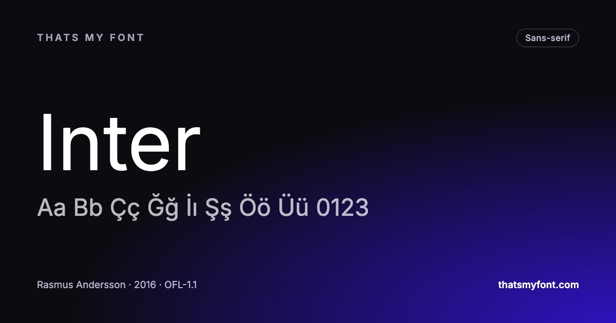
Inter is the one most people end up with, and it is the right answer for interfaces rather than a lazy one. It shares the horizontal terminals and the closed apertures, and it was drawn for screens — a taller lowercase, more open spacing at small sizes, and a set of features Helvetica never had because it was cut for metal. Set side by side at 48 pixels the difference is visible; set at 15 pixels in an interface, Inter is the better face.
Arimo is a different proposition. It is metrically compatible with Arial, meaning every character occupies exactly the same width — so a document laid out in Arial keeps its line breaks and page count when Arimo is substituted. If the goal is a document that has to reflow identically rather than a face that looks like Helvetica, this is the one.
Roboto is worth naming precisely because it is often recommended for this and is not really a Helvetica substitute: its curves are more compressed and its terminals are cut at an angle, which makes it a grotesque with a different accent rather than the same one. It is an excellent face and it will not fool anybody.
How to judge a substitution yourself
Set the same word in both, at the same size, one above the other. Use a word with the letters that matter: Registration contains an R, a g, a t, an a and an i, which is most of the tells in one go. Then look at the terminals of the s and the c, and at the leg of the R.
Every font page here names what a face can honestly stand in for, and refuses to guess where there is no real match — an empty list is a more useful answer than a plausible wrong one. The alternatives section compares them face by face, including for Calibri, Futura, Georgia and others.
The licensing point nobody mentions
A Helvetica desktop licence does not usually include web use, and a web licence is commonly capped by monthly page views. Every face named here is under the SIL Open Font License: free for commercial work, free to self-host, free to embed in an app, with no cap and no renewal. For a lot of projects that is the deciding argument rather than the shapes.
Metric compatibility, and when you actually need it
A metric-compatible font has the same character widths as the one it stands in for, so a document set in it keeps its line breaks and page count exactly. That matters for a contract, a form or a template somebody else will open — and not at all for a website, where the text reflows anyway.
The distinction catches people out here, because the widely available metric match is for Arial rather than Helvetica: Arimo matches Arial’s widths, and Arial itself was drawn to Helvetica’s. If what you need is a document that repaginates identically, that is the chain to follow. If what you need is the look, ignore metrics entirely and compare the letterforms.
The letters to compare, in order
Two grotesques can look identical in a specimen and completely different in a word. Six characters carry most of the difference, and comparing them takes a minute.
- R: Helvetica’s leg comes down straight and then kicks out. A curved, splayed leg is Arial and reads as softer.
- a: look at the tail at the bottom right. Helvetica has none to speak of; Arial curves away.
- t: the top is cut at an angle in Arial and straight across in Helvetica.
- G: Helvetica has a spur — a small vertical step. Losing it changes the whole word.
- 1: a plain flag and no base serif is the grotesque tradition; anything more decorated belongs to another family.
- e and s: how closed the apertures are. This is what makes Helvetica look tight rather than friendly.
Set the same word in two candidates at 120px in the compare tool and those six differences are obvious in seconds — far quicker than reading a description of them.
Setting a substitute so it behaves like the reference
Half of what people recognise as Helvetica is not the drawing, it is the setting: tight tracking, large sizes, plenty of white space around a short line, and usually a single weight per piece. A good substitute set loosely will not look like the reference, and an average one set tightly often will.
- Tighten large headlines slightly — around minus 0.01 to minus 0.02em at 48px and above.
- Give capitals a little extra spacing, 0.05em or so, exactly as you would with the original.
- Keep the weight range narrow: regular and bold, not five weights on one page.
- Leave body text alone. Tracking a paragraph is what makes a substitution look like a substitution.