A CV has two readers and the first one is not a person. Most medium and large employers run applications through tracking software that extracts the text before anybody looks at it, and a document that parses badly is filtered out without being read. That constrains the typography more than taste does.
What actually breaks parsing
Not the choice of typeface, in most cases — the extraction reads the text layer, so any font with a proper character map works. What breaks it is everything around the type: text inside images, text in headers and footers, multi-column layouts read in the wrong order, and tables used for layout.
Where the font does matter is coverage. A face missing a character in your name, your address or an accented company name produces a gap or a substitution in the extracted text, and that is your name being wrong in their database.
So the requirements are narrow
- A complete character set — including accented capitals, because names are often set in title case.
- A clear distinction between the lowercase l, the capital I and the digit 1, since phone numbers and dates get read by a person too.
- Enough weights to build a hierarchy without underlining anything.
- Readable at 10 to 11 point on paper, because somebody may well print it.
Faces that meet all of that
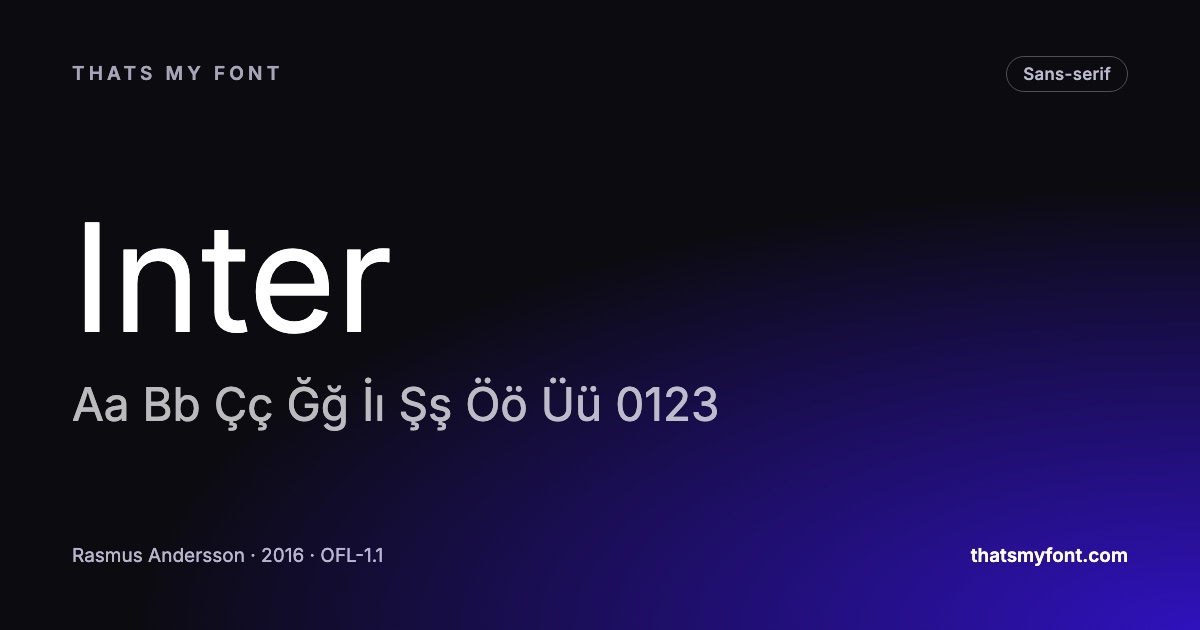
Inter and Source Sans 3 are neutral, thoroughly drawn and unambiguous where it counts. IBM Plex Sans is the same reliability with slightly more character, which is useful in a design or engineering field. If a serif suits the field better, Source Serif 4 and Lora both hold up at CV sizes on paper and on screen.
| Family | Variable download | Static download |
|---|---|---|
| Inter | 957 KB2 files | 9.1 MB54 files |
| Source Sans 3 | 415 KB2 files | 2.0 MB16 files |
| IBM Plex Sans | 637 KB2 files | 4.8 MB42 files |
| Source Serif 4 | 989 KB2 files | 6.0 MB64 files |
| Lora | 224 KB2 files | 555 KB8 files |
The practical settings
- 10 to 11 point for body text, 14 to 16 for your name, and one step between for section headings.
- One typeface, two or three weights. Two typefaces is a design decision that has to earn itself; on a CV it rarely does.
- Left-aligned, not justified. Justification opens rivers of white space in a narrow column.
- One column for anything the software has to read. A sidebar is a second column and the parser may interleave it with the main text.
- Export as PDF with the fonts embedded, which is the default in every current word processor.
And the one that is not about software
Whoever reads it after the parser is reading their fortieth CV of the day. Generous line spacing and a clear hierarchy do more for you than any choice of typeface. The font should be invisible; the structure should not be.
What the parser actually reads
Tracking software does not see your CV. It sees the text layer the PDF exports, in the order the file stores it, and then tries to work out which lines are headings, which are dates and which are job titles. Everything that helps it is structural rather than typographic.
- Real text, never a picture of text. A designed CV exported as an image parses as an empty document.
- Section headings in the words the software expects: Experience, Education, Skills. A clever synonym is a heading the parser cannot classify.
- One column for anything that has to be read in order. A sidebar is a second column, and the extraction may interleave it with the main text.
- Dates in a consistent format, on the same line as the role they belong to.
- Plain bullets. Custom glyphs sometimes extract as question marks or vanish entirely.
Which file to send
PDF, unless the posting asks for something else — it is the only format that looks the same everywhere and embeds the font so your typeface actually arrives. Modern tracking systems read PDFs perfectly well; the advice to send Word files is a decade out of date, and a .docx opened on a machine without your font is set in a substitute you never chose.
Two details that cost nothing: name the file with your own name rather than "CV final v3", and keep it under a couple of megabytes so an email filter does not strip it. Fonts embedded in a PDF are a normal, licensed use of every family in this archive — see what the Open Font License lets you do if an employer ever asks.
The settings that make it look considered
- Margins of 15 to 20mm. A page crammed to the edges reads as desperate before a word is read.
- One typeface, three weights: regular for the body, semibold for headings, and one step lighter or a smaller size for dates and locations.
- Line spacing around 1.3 for body text, and a clear gap between sections — more than between lines, less than a blank line.
- Numbers aligned. If the face has tabular figures, use them for dates so the columns line up.
- Two pages at most, and one if you have less than ten years of history.
A portal and a human are two different deliveries
Applying through a portal and emailing a recruiter are not the same job. The portal parses the file and often shows the result to the reader as extracted text, where your typography is gone entirely. The recruiter opens the PDF and sees exactly what you designed.
So make one document that works both ways rather than two documents. Keep the structure plain enough to parse, and put the design into the things that survive extraction — clear hierarchy, sensible section names, a readable size — rather than into a layout that only holds together visually. If a portal offers a preview of what it extracted, read it: that is your CV as half the audience receives it.