Google Fonts holds around 1,800 families and almost every list of "the best" ranks them by download count, which measures what was popular in 2016 rather than what is good. A more useful list is organised by the question you are trying to answer, because that is how a font gets chosen in practice.
For an interface
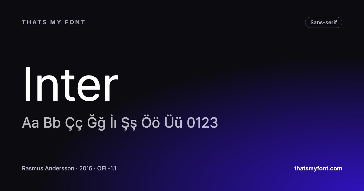
Inter is the default and deserves to be: drawn for screens, tall lowercase, l and I and 1 all distinguishable, tabular figures, and an optical size axis that adjusts the drawing to the size it is set at. IBM Plex Sans is what to use when an interface should not look like every other interface — it reads as engineered rather than neutral and brings a matching serif and mono with it.
For long reading on a screen
Lora and Merriweather were both drawn for text on displays: sturdy serifs, a large lowercase, moderate contrast. That is the combination that survives a phone screen, and it is why a Didone set at body size looks broken while these do not.
For a headline that has to carry the page
Playfair Display is high contrast and unmistakably editorial. Bebas Neue is condensed capitals and has become the default poster face, which is a reason to use it and a reason to modify it. Anton does what Impact does and can actually be shipped.
For code
JetBrains Mono has the tallest lowercase of the coding faces and was drawn for exactly this. IBM Plex Mono is warmer. Fira Code is the one that popularised programming ligatures. The full comparison goes through what actually separates them.
For a brand that needs its own voice
Outfit and Manrope are geometric without being cold. Space Grotesk has genuine oddities in its letterforms and is the reason a certain kind of technology site looks the way it does. Fraunces is a serif with a softness axis, which is unusual enough to be worth knowing exists.
| Family | Variable download | Static download |
|---|---|---|
| Inter | 957 KB2 files | 9.1 MB54 files |
| Lora | 224 KB2 files | 555 KB8 files |
| Playfair Display | 270 KB2 files | 1.0 MB12 files |
| JetBrains Mono | 187 KB2 files | 892 KB16 files |
| Outfit | 58 KB1 file | 270 KB9 files |
The ones to be careful with
Not because they are badly drawn — several are excellent — but because they are so widely used that they carry someone else’s associations. Montserrat, Poppins and Raleway are on a very large number of sites. If a project needs to feel particular, that is worth weighing.
A note on where you get them
All of these are under open licences, which means you can download and self-host them rather than linking to Google’s servers. That is now both the faster option and the private one — see the GDPR post. Every font page here has a WOFF2 download and a Latin-only cut for exactly that.
Cutting 1,800 down to a shortlist in ten minutes
A gallery is the wrong tool for this. Scrolling a wall of names in alphabetical order tells you nothing about whether a face will survive the job you have, and after forty of them every sans looks like every other sans. The way to do it is to decide the constraints first and let them do the eliminating.
- Decide the category before you look at anything. An interface is a sans; a long article can be either; a poster is a display face. That alone removes three quarters of the library.
- Decide how many weights the design needs. A page with a heading, body text and a caption needs three, and a family with two will have you faking the third.
- Check the alphabets. If the work is Turkish, Greek, Cyrillic or Vietnamese, that is the filter that matters most and almost nobody applies it first.
- Set your own words in the top three. Not a pangram — the actual headline, the actual name, the actual longest menu item.
- Look at the one you chose at the real size, on the real background, before you commit.
Every one of those steps is a control on this site rather than a judgement you have to make from memory: the archive filters by category, style and alphabet with the counts beside them, the compare tool sets three faces in the same words at the same size, and the Lorem Ipsum page puts a paragraph of it in a frame the width of your column.
What the library actually is
Google did not draw most of these. The library is a distribution channel: independent designers and foundries release a family under an open licence, Google hosts it, and anyone may use it, modify it and pass it on. A handful were commissioned directly — Roboto and Noto among them — and the rest come from type designers who wanted their work used.
That matters for two practical reasons. The first is that quality varies enormously, because the library is not one studio’s output. The second is that you are not tied to Google’s servers: the files are yours to host, which is the answer to both the privacy question and the speed question. Self-hosting takes ten minutes, and every font page here has the web font ready to download.
| Category | Fonts | Carry Türkçe | Share |
|---|---|---|---|
| Sans-serif | 118 | 110 | 93% |
| Serif | 76 | 66 | 87% |
| Display | 66 | 50 | 76% |
| Monospace | 40 | 36 | 90% |
| Handwriting | 37 | 28 | 76% |
| All fonts | 337 | 290 | 86% |
Putting two of them together
The pairing question is where most shortlists fall apart, and the usual advice — "pair a serif with a sans" — is not a method. What actually works is choosing two faces that agree on the things a reader notices unconsciously (the height of the lowercase, the width of the letters, the overall colour of a block of text) and disagree on something obvious enough to look deliberate.
The shortest route to a pairing that works is a superfamily: IBM Plex, Source, Noto and Fira each publish a sans, a serif and a mono drawn to the same skeleton, so the decision has already been made by the person who drew both. Our font pairing guide has the method for the cases where you want two faces that were not made for each other.